2.8. Write the protocol: Annotated Tableau dashboard of Scopus data
Duration: 45 min
Goals
- Activate your knowledge to analyze a new kind of data
- Discover scientometric data from Scopus
- Extract semantic data (words) from abstracts
- Make a Tableau dashboard
- Annotate the dashboard
- Write the protocol
Case
Fake news. This time we situate the case in the academic arena: we will analyze scientific publications.

Data
Download these two CSV files:
scopus-fake-news.csv
This is the list of the 1,761 open access academic publications mentionning the term “fake news” in their abstract in the Scopus database.
Preliminary
Take a look at this file in Tableau. Understand its structure, it will help you later on.
Task
Here is what we ask you:
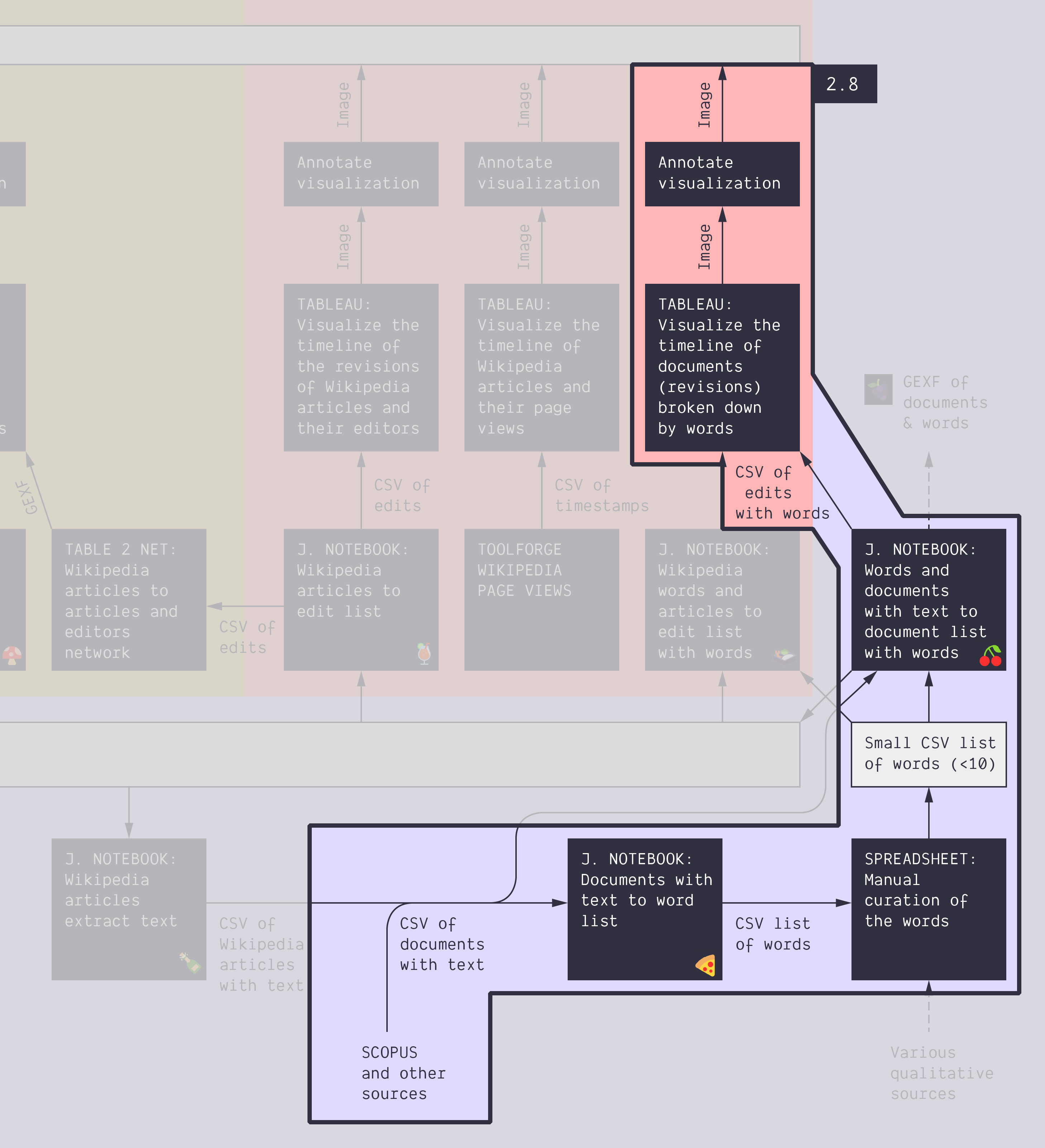
- Extract the important terms from the abstracts. It may look like this. You will need this 🍕 notebook.
- Make a selection of terms.
- With your selection and the list of documents, extract which terms are in which documents.
- You will need this new notebook: 🍒 Words and documents with text to document list with words.
- It outputs three files:
- The documents with terms as additional columns
- The document-term pairs
- A bipartite network of terms and documents
- Visualize the non-network data in Tableau as a dashboard, focusing on time.
- Find a data-driven narrative.
- This narrative depends on your selection, that is why you certainly have to iterate by refining your selection of terms and redoing the steps from point 2. to improve your narrative. You may have to do it several times.
- Annotate your dashboard to support a data-driven story.
- Write the visual protocol.
Documents produced
Keep somewhere, for sharing, the following documents:
- The annotated visualization(s) (JPEG or PNG)
- The visual protocol (JPEG or PNG)
Next activity
Take a short walk before the last activity of the day:
2.9. Write the protocol: Annotated Scopus author-article network map (45 min)