
How to use
1. How to create a corpus (dataset)
This tool will analyze a corpus (a dataset) of text documents. Each document is simply a bit of text that you found on the web (or elsewhere). It can be as short as a sentence, or as long as a newspaper article. But it has to be just text (no images or other media).
First, let’s see how it works, then we will see where to find documents and how to select them.
How to get started
Click on “Get started” in the menu to load the “Documents” page.
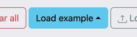
If you just want to see the tool in action, load an example from the menu at the bottom of the screen.
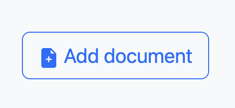
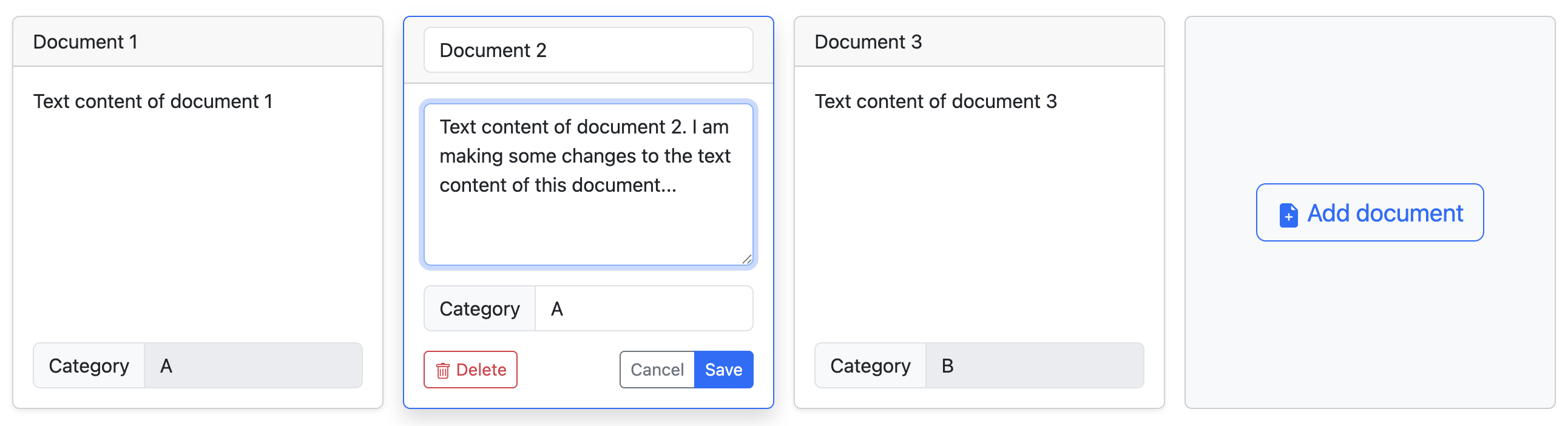
If you want to make your own corpus, then click on “Add document” to start editing your first document.
This will open an interface to edit your first document.
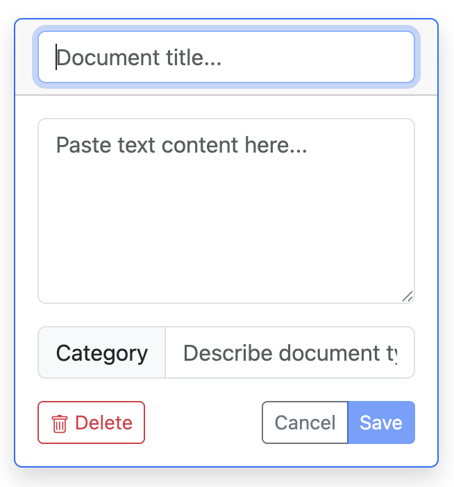
A document consists of three parts:
- A title
- Textual content
- A category
How to fill a document
Let’s assume that you have a source of information, like a Wikipedia page, to use as a document.
- First, give a title. You can invent it, or reuse your source’s title (if it has one). It is just a way to identify your document easily. Type it in the top field of the interface.
- Second, copy-paste the textual content of your source into the middle field of the interface.
- Third, type a category in the bottom field. Be consistent in your spelling, or else each different spelling will count as a different category. We explain how to decide categories down below.
Once you have filled all three parts, you can save your document by clicking on the “Save” button. Note that you cannot save your document if it is not complete.
How to manage the dataset
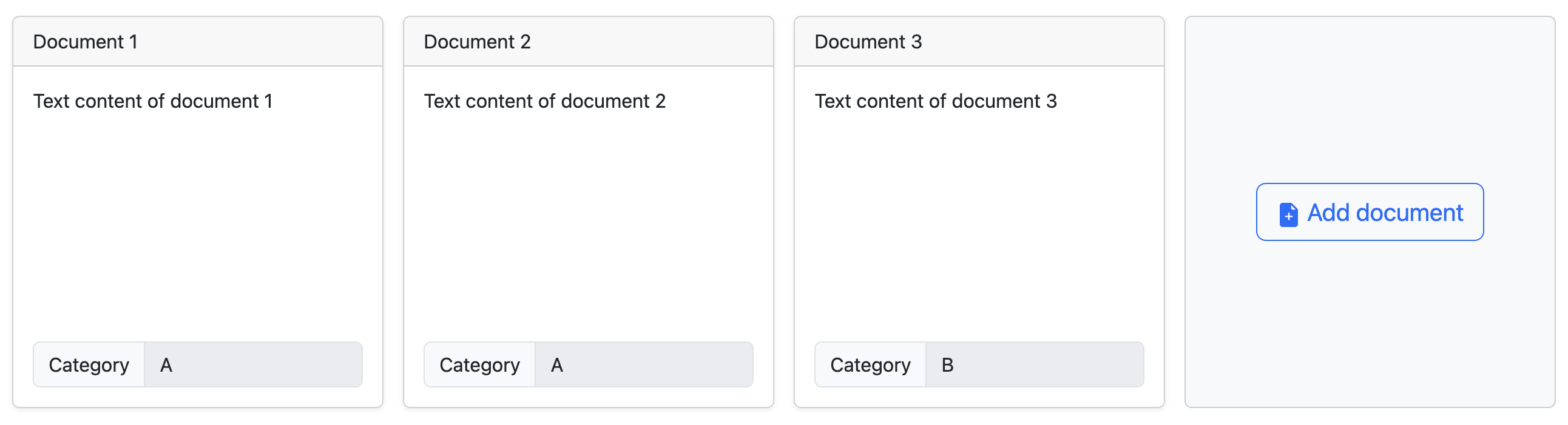
You can create as many documents as you want.
We think you need at least 10 documents, but 20 is a better number. You could go up to 50, or more if your computer is powerful enough (it will take more time to compute).
Click on a saved to enter edit mode again. You can change it, or even delete it. Remember to save (or cancel) your changes.
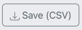
You can save your dataset by clicking on the “Save (CSV)” button. You will be able to upload it later on, or share it with other people.
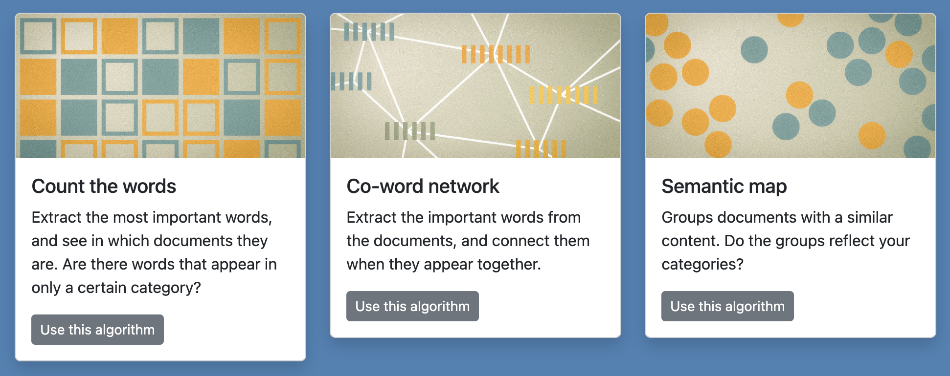
Once your corpus is ready, click on one of the three algorithms available just below your set of documents. They do different things. You can try them all. You will be able to come back to your documents and edit them if you want.
Where to find documents and how to decide categories?
First of all, you can just try the tool and experiment with it to understand why categories matter. Feel free to experiment.
That being said, you will obtain the best results at three conditions:
- Find documents that naturally separate into two parts, like water and oil.
- Pick categories that reflect these two parts.
- It should not be completely obvious that the two groups are well separated.
If you add two groups of documents that are completely different, for instance articles about cheese and articles about sailing, they will separate but that is not interesting because we know for sure that they will. Maybe that would be interesting if they did not separate.
The good documents and categories should always be a little bit surprising. If you add two groups of documents where it is hard to know if they will be the same or not, then it is interesting. It provides a new information, because we did not know. You will find examples below.
The documents and the categories go together. Select them to make an interesting comparison. Think of them as a way to ask question such as: “Do you think that documents A and documents B are similar or different?” And of course, that question is interesting if it does not have an obvious answer. The algorithms will allow you to find and answer to the question you ask.
You could compare how we talk of two similar things. For example, you could compare how we talk about two religions, or men and women, or two nationalities, etc. That could be a way to look into discrimination. For instance, you could compare Wikipedia articles about male pop artists with Wikipedia articles about female pop artists. This would ask the question: “Are Wikipedia articles about male and female pop artists different or the same?” The answer is not obvious because, on the one hand, they are all pop artists, but on the other hand, they are men and women. So it is an interesting thing to look at.
You could also compare how two different media write about the same thing. You could compare how left-wing newspapers and right-wing newspapers write about the same subject, for instance immigration, the European Union, or nuclear energy. Or you could compare how a same topic is discussed on social media (Reddit, Facebook…) versus on mainstream media (newspapers, TV channels…). Or you could compare local press and national press, or the local press in one region and in another region, etc.
There are yet other ways to make interesting comparisons, like old articles versus new articles (ex: before and after Covid), science versus popular culture, etc. Be creative!
The important is to pick documents that have the difference you aim to compare, but no other difference. If you compare documents from two media, keep a same topic; conversely, if you compare two topics, pick documents from the same media or similar ones.
In this tool, a document can be any text. Don’t be afraid to copy-paste texts that don’t look like traditional documents, for example discussions on social media. Not every document has to look serious and official. It depends on what you want to compare. What normal people say over the internet also counts as a information worth analyzing.
You will find documents in many public websites: Wikipedia, the Internet Movie Database, Fandom…
You can also use social media such as Reddit, YouTube (look at the comments), etc.
And via libraries, you can also have access to newspaper articles from many outlets. Those are normally behind a paywall, but libraries often provide a special free access to them. And sometimes, you can search them for free, for instance the BBC.
2. How to use: Count the words
This algorithm simply counts in how many documents a given word is mentioned. Note that it does not matter if the word appears once or multiple times in a same document.
Type any word in the search field (and hit Enter) to start the counting.
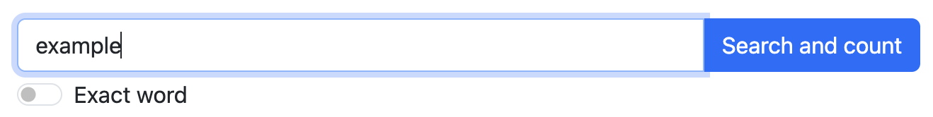
By default, this will not count the exact word, but any word that contains it. For example, “train” will also count “trains” and “training”. If you do not want that, check the setting “Exact word”.

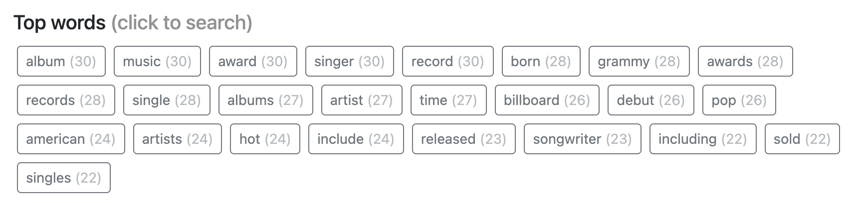
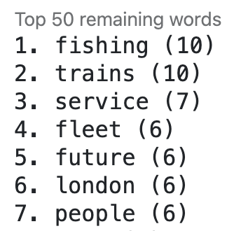
Alternatively, click on one of the top words to search for it. Those are defined as the 25 words appearing in the largest number of documents, stop words aside. The number in parentheses indicates in how many documents they appear.
Note: you can find other good words to analyze in “Co-word network”.
Word counting results
Your search will show you the result of counting how many documents contain your word in two ways.
First, a bar chart displaying the percentage of documents mentioning your query for each category. The bigger the bar for each category, the largest proportion of documents in that category mention the word you queried.
Second, details about where the word is mentioned in each document (if it is).
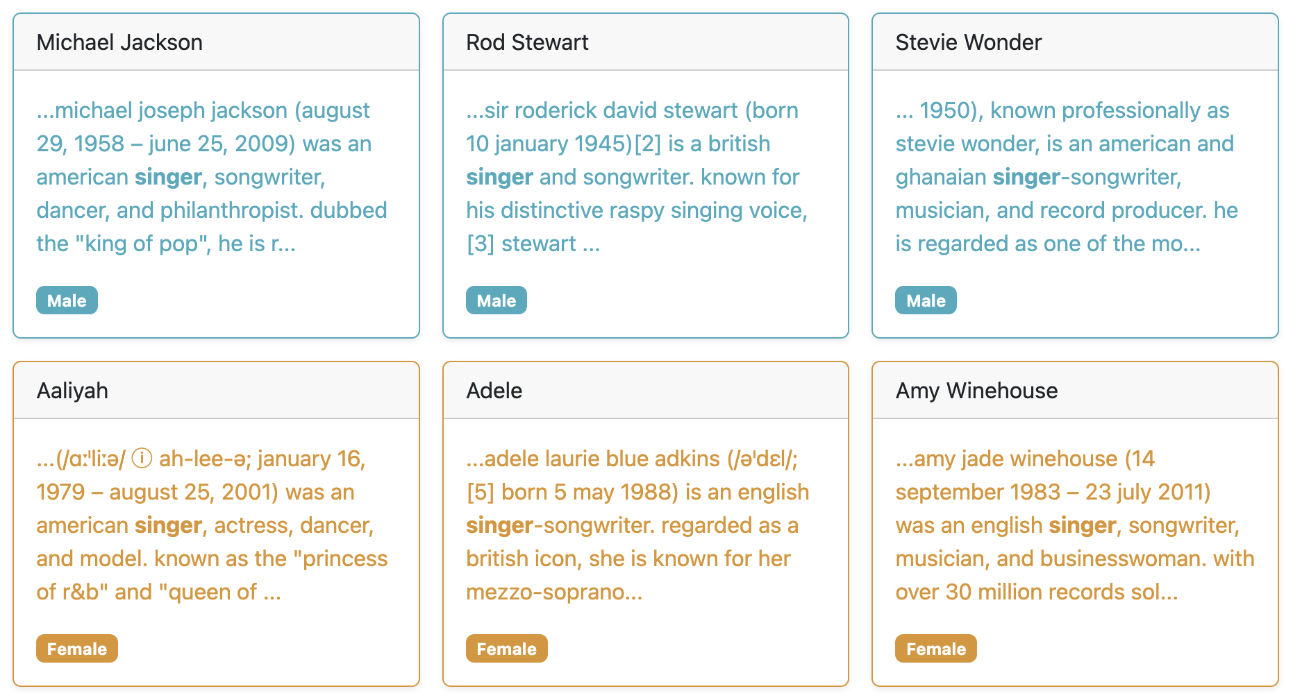
Use those details to verify that your query works as intended.
Try to find words that match only one category
The interesting words are those appearing in only one of those categories, and not the other. These words characterize a specific category.
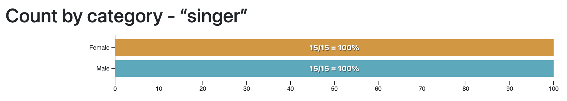
Here is an example with the dataset about male and female pop artists on Wikipedia, which is one of the sample datasets you can try.
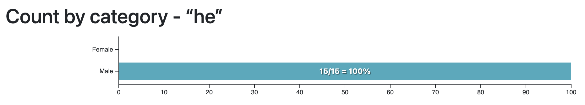
The word “he” is only present in the descriptions of male artists…
…while the word “she” is (almost) only present in the descriptions of female artists.
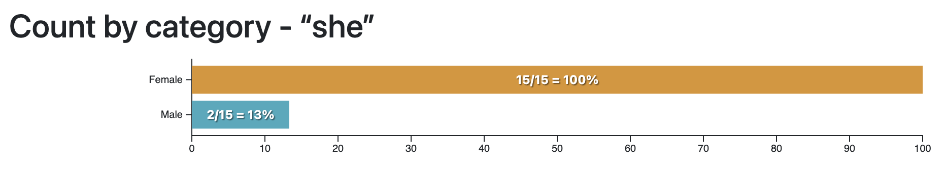
Note: this only works if you search for the exact word, since of course “he” is contained in “she”!
This example may be too obvious to be really interesting, but it shows you what it means, for a word, to be characteristic of a single category. The next examples, with the same dataset, might be more interesting.
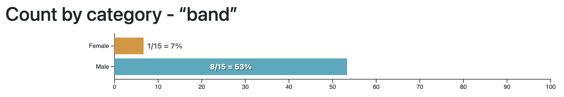
The word “band” is mostly associated with male artists. Perhaps more of them play in a band than female artists?
The word “highest-paid” is mostly associated with female artists. Perhaps the success of female artists is more often measured with money than the success of male artists?
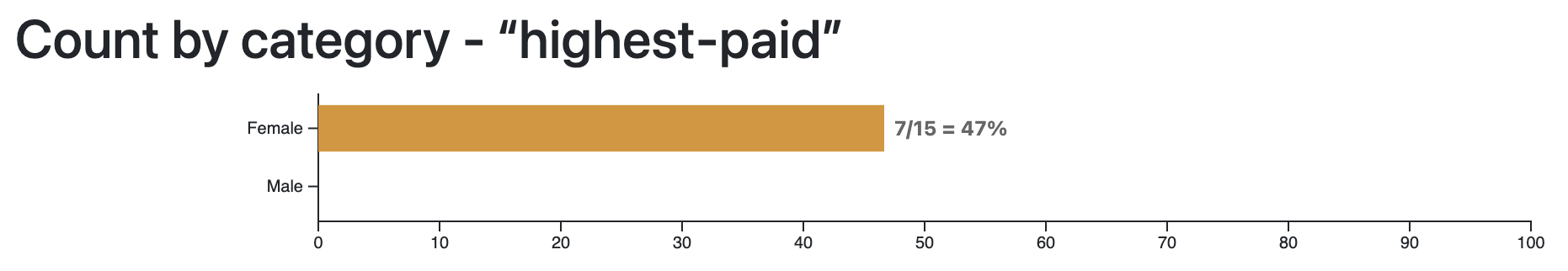
This algorithm does not give you a definitive answer, but it helps asking interesting questions.
To find interesting words, use the next algorithm, “Co-word network”, and look for words colored strongly like one specific category.
3. How to use: Co-word network
This algorithm makes a network of words connected when they appear in the same documents. Let’s look at the resulting network before returning to the settings.
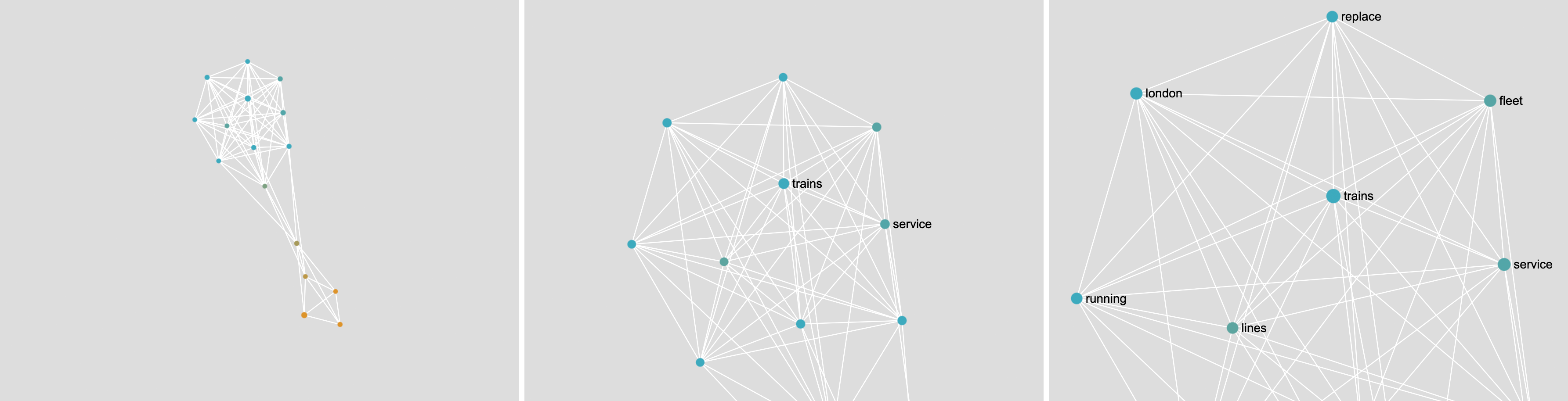
If you have two very different kinds of documents, the network will have two distinct parts. In the example below, you have the words from BBC news articles about fishing (in blue) and about trains (in yellow). As fishing and trains have nothing in common, the network separates quite well.
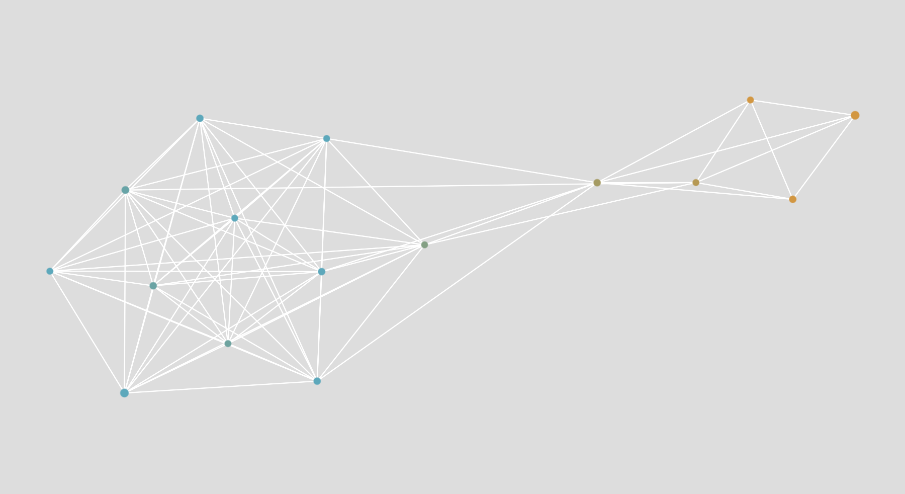
Note: there is a word that connects the blue part to the yellow part. We call it a “bridge”. It is one of the rare things the two kinds of documents have in common. In this case, it is the word “future”.
If your documents are relatively similar, the network will not look like it has distinct parts. In the example below, you have the words from Wikipedia articles about male (blue) and female (yellow) pop artists. The articles are very similar, and most of the words are the same (“award”, “grammy”, “artist”…).
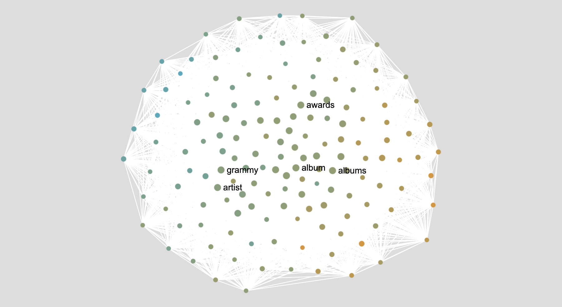
Nevertheless, if you look closely, you will see that there is a more blue side (on the left) and a more yellow side (on the right). That is because there are still some differences even though the documents are very similar.
The network helps you find words that are specific to one category, and words that are connecting the categories (“bridges”).
You can reuse interesting words as queries in the “count the word” algorithm.
If your documents are very similar and it looks like your categories do not separate well, also try the third algorithm “semantic map”, as it is even better at finding differences. However, the semantic map visualizes documents, while this network visualizes words.
How to use network settings
This algorithm is also just counting the words, except in a more fancy way than the “count the words” algorithms. Sometimes, there are different ways to count. That is why there are settings: you could decide to count one way or another. You can just try different settings and look at the results to explore the algorithm!
Settings about counting word occurrences
The first step is simply about counting the words, essentially the same way as the first algorithm.

Should the title be analyzed as part of the text, or not? If you have invented the title of your documents, then you should probably not use it as part of the text. But if the title was actually from the document, for instance with newspaper articles, then it’s a good idea to include it.

How to count the words? We have two options.
- Count them once per document, not matter how many times they appear in that document.
- Count how many times they appear in total, including when they appear multiple times in a same document.
We think that the first option works better, but you can try the other one. It’s interesting to look at the effect it produces.
With the first option, the highest score is the number of documents in your dataset.
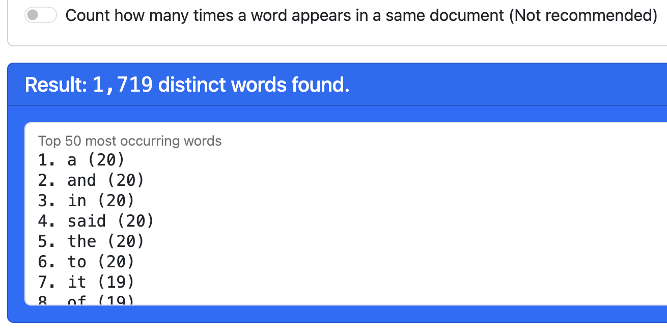
With the second option, the highest score is much higher, as some words appear many times in a same document.
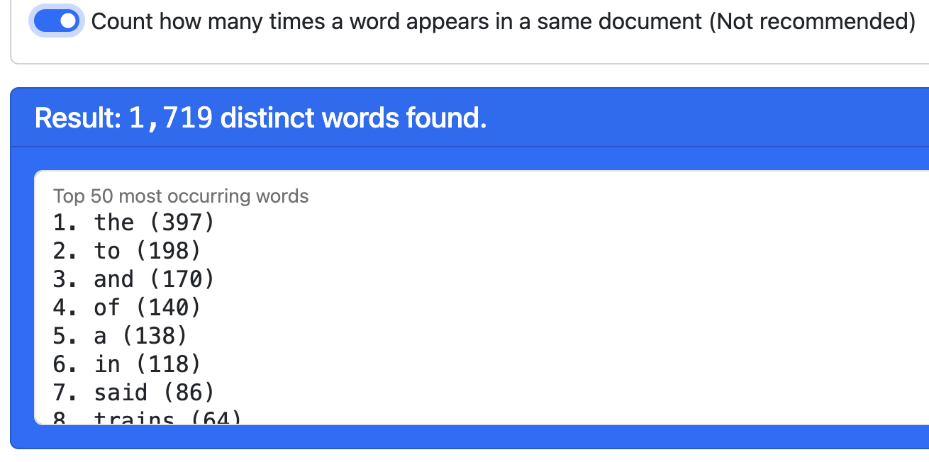
As you can see by comparing the results, the words with the highest score are not the same.
Settings about removing unnecessary words
We call “stop words” the words of a language that we don’t find interesting. Those are the tool words we use to make sentences work, but that do not carry much meaning because they are everywhere, all the time. For example “the”, “of”, or “and”.
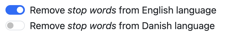
The stop words are not the same in different languages. This tool has a stop words list for each language it supports. Use the list corresponding to the language of your documents.
The words with the highest count tend to be stop words, as you can see above. Which is why we want to remove them. Once stop words removed, the top words are more interesting:
In addition to that, we also want to remove the words that do not appear often enough.
Use that setting to make your network bigger or smaller, which depends on how many documents you have, and how long they are.
On the one hand, we don’t need the network to be too big (slower to compute, more difficult to read). But on the other hand, if you keep words that appear less often, the network will be less interesting (because the separation pattern will be weaker). Try finding the best setting!
Co-occurrences
Everytime two given words appear together in a document, we say they “co-occur”. Therefore, the “co-occurrence” score is counting how strongly two words are connected in the dataset.
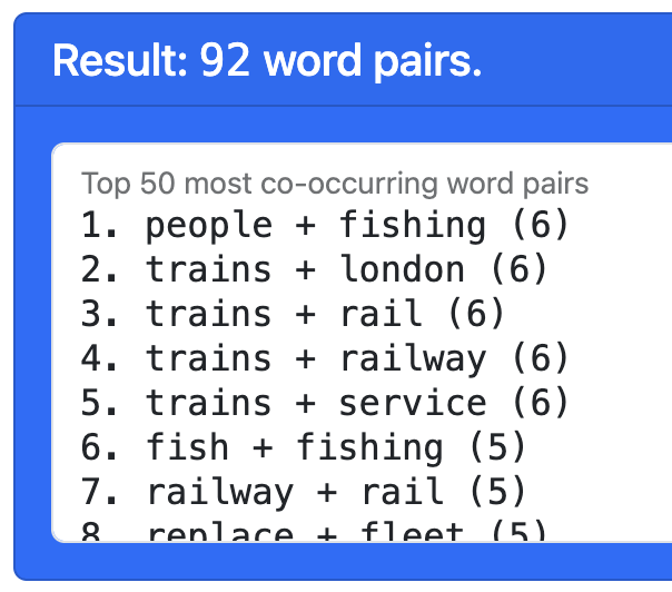
There are no settings, as this calculation is straightforward. But it’s interesting to see which pairs co-occur the most. Those pairs will become the links of the network.
Settings about displaying the network
The network visualization uses a layout algorithm to position the words in the picture so that they are close when they are connected (that is, when they co-occur). The goal is to make it visible when there are two or more groups of words (clusters) that match the categories. Two settings are used to improve the result, but you can disable them if you want.
The first improvement is to normalize the co-occurrence scores by using a metric known as pointwise mutual information. In short, it helps by taking into account that some of the words are mentioned more often, which makes them more likely to co-occur. On a practical level, it makes the network more readable.

The second improvement is to remove the disconnected words. Those are rare, but it may happen sometimes. They are distracting and are not very interesting, since they are not linked to any other word, so we can just remove them.

How to read the co-word network
Each dot is a word, colored according to categories. Each dot has a color blend corresponding to the categories of the documents where it is mentioned the most.
Each white line is a co-occurrence relation between the two connected words.
Two dots (words) that are connected (co-occur) tend to be placed closer through the effect of the layout algorithm Force Atlas 2. As a result, distinct visual groups, even if they are not completely disconnected, indicate topics (a topic being a group of words that tend to be mentioned together).
Note that the layout algorithm is “non-deterministic”: the result varies from one time to another because it requires a randomized initialization. Yet, as you can see if you try, the clusters (topics) are always the same. They can be rotated, flipped, or slightly changed, but they will always be the same, have the same size, etc.
You can move the network view by dragging with the cursor or your finger on a touch screen, and zoom in and out with the scroll wheel, pinch zoom, or equivalent supported by your device. Use it to explore the network and find interesting words.
4. How to use: Semantic map
This algorithm is entirely automatic and requires no settings. It works in two parts.
The first part consists of using a “text embedding model”, and more precisely all-MiniLM-L6-v2, which is multilingual (it “speaks” most languages). It transforms any text into a semantic representation. We will not explain how it works, but rather what it does.
This model uses AI to transform any text into a series of numbers. In mathematics, we say it gets “embedded” into a “vector”. Each vector is very long (hundreds of dimensions) and encodes the meaning of that text. On a practical level, these vectors have a very interesting property: similar texts produce similar vectors.
The distance between vectors encodes semantic similarity:
- Completely different documents produce very distant vectors
- Documents about the same topic produce quite close vectors
- Documents that mean the same thing but written differently have very close vectors
- Almost-identical documents produce almost-overlapping vectors.
We use this property to produce the semantic map.
The second part of the algorithm consists of visualizing the vector space as a map. This is called “dimensionality reduction” because we reduce the very long vectors to two dimensions. In other words, we reduce them to points on a plane. To do this, we use a technique named UMAP. You can learn about it on this page. In short, it produces a map that preserves the most important property: distance encodes semantic similarity.
The resulting semantic map can be read as such:
- Each dot is a document from your dataset
- The color of the document indicates its category
- Dots (documents) are close when they have a similar content, and are far away when they have a different content.
Like for the co-word network, this visualization is non-deterministic. Because of a random initialization of the algorithm, the result is a little bit different every time. However, the groups of dots or “clusters” will always be the same. They will simply be flipped or rotated every time.
How to interpret the semantic map
Look at the semantic map and ask yourself two questions:
- Are there distinct groups of dots (clusters)?
- Are there distinct color groups?
Those two question may look the same at first glance, but they are in fact two different and independent questions.
Are there distinct clusters?
By “distinct groups”, we mean groups of dots that are in different parts of the pictures. We can also call them “clusters”. Each cluster consists of dots (documents) that are close to each other, while the clusters themselves are far away from each other.
In the example below, we have one single cluster. This means that all documents have a similar content.

In the example below, we have two distinct clusters. This means that there are two groups of documents with different contents, probably two different topics.

Note that using different languages in the same dataset can also produce different clusters.
The clusters are only about the text content of the documents, not the category. The clusters are identified by looking solely at the dot placement. Clusters are independent of the color. The placement does not take your categories into account. This point is very important, as we will see.
Are there distinct color groups?
The second question you should ask is whether the colors are mixed, or grouped together.
If the colors are mixed, it means that your categories do not capture any semantic difference. In other words, documents of the same category are not particularly similar. It could look like this:
If the colors form groups, it means that they capture some semantic similarity. It could look like this:
In the example above, the documents are not very different, because they form one single cluster. Nevertheless, the cluster has two sides, which shows that there are semantic differences within the cluster. The categories still capture a small semantic difference.
Very importantly, having clusters does not mean that your categories capture their semantic difference.
Indeed, it is possible to have two clusters (in terms of dot placements) yet have mixed colors. This will look like this:

The right thing to do, in this example, is to understand what the two groups are, and redo the categories accordingly. This way, you will be able to explain what makes the documents different.
When colors and clusters match, which may look like the example below, then the categories do capture the semantic differences between the documents.

Anomalies and nuances in the map
Note that real-world datasets are not as well defined as the examples above. That is even better! Every time you see an anomaly, you have found something interesting to talk about. Anomalies are relevant and valuable.
In the following example, we see two very well separated clusters, which are mostly color-coded, but there is one anomaly: there is a blue dot in the yellow dot (look on the right). Is it a mistake?
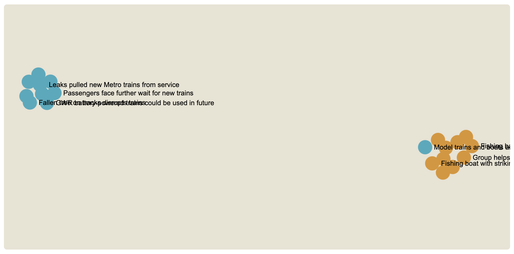
This dataset contains BBC news about fishing (blue) and trains (yellow), which should have nothing to do with each other. In that sense, it’s not surprising that we have two very distinct clusters. But what is going on with the blue dot? We can zoom in and click on the dot to take a look at the document.
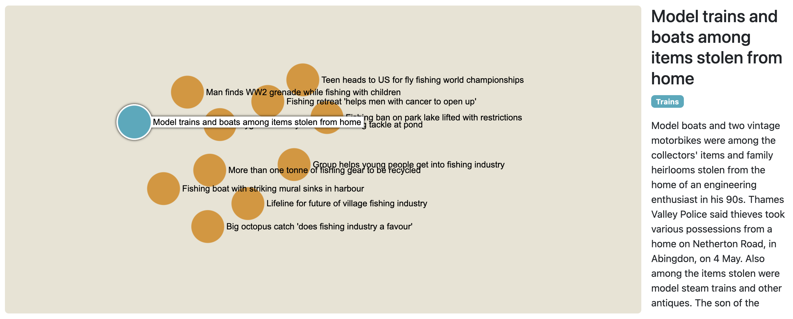
This reveals something interesting: this article is not about real trains, but toy trains and, importantly, toy boats. This is why the embedding has considered that it was more similar to the news about fishing than to the other train-related news. That is an interesting find!
Also remark that, of all the documents of that cluster, the anomaly is the closest to the other cluster: that is not a coincidence.
If we look at another dataset, the male and female pop artists on Wikipedia, we see that the semantic map has two clusters but they are not very far apart. Of course, that is because the two categories have more in common (being pop artists) than fishing and trains.
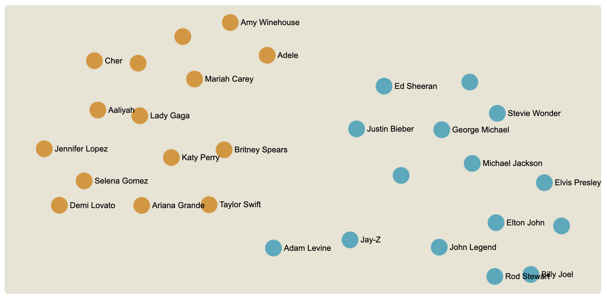
It is not an issue that the two clusters are not completely separate. On the contrary, if we look at the details, we can identify the dots that are the most in-between or the most on the sides. For instance, Taylor Swift is the female artist who is the most similar to the male artists, and Adam Levine is the male artist most similar to female artists. Conversely, Cher is the most different from male artists and Billy Joel is the most different from female artists.
Once again, one cannot find a definitive interpretation for these nuances, but it begs intriguing questions. Semantic maps have a lot of interesting details to analyze.